


ICON10 Mock Poster
ICON10 is an Illustrator Conference, and for a Typography Class assignment I was tasked with taking a previous year's ICON10 information and designing an original poster to advertise it, as well as an original brochure meant to guide guests through the conference.
The Poster
Names of presenting artists and their relevant information are included and highlighted
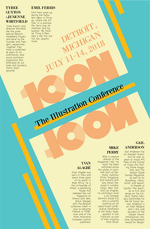
Throughout the concepting process I ended up greatly interested in the idea of combining the 10 into the ICON of ICON10. As for layout, I realized that with the layering of the 10 over the ICON, then the element of layering could be continued throughout the rest of the poster and the brochure.
I chose teal and blue because those colors complemented each other. I was in part inspired by the film "Hugo" for this color choice, because it used a teal and orange color palette in a manner similar to a classic black and white film. Because of that, I wanted to give the color combination a try myself.
The Brochure

Brochure cover (front and back)
Brochure Interior (pages 4 and 5)

I kept the cover of the brochure similar to the poster in order to visually unify the two products. I also kept the idea of layering elements over each other, but in this case, it was meant to express information.
I chose to express the hours of the talks in a graph like this because of previous experience attending another convention. When I held my brochure during that convention, I had trouble coordinating what events I wanted to see because I would sometimes notice only belatedly that some events were scheduled for the same time slots. If I had had a graph like this, I would have had a simpler time planning the best use of my time at the convention, so in essence I made something that I wished that I had had during that convention.